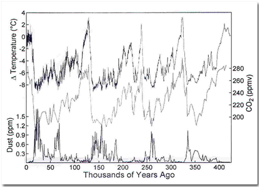
(making sense of a complex graphical representation)
The graph and questions come from a "practical" in a first year Earth Systems Science course:

Question: Does temperature show a positive or negative correlation with CO2 concentration? What does this mean?
Question: What is the relationship between temperature and the amount of dust in the atmosphere? Why do you think this is?
Students need to:
- read a chart that has three different scales
- translate the observation that the patterns shown by the top two charts are similar into a conclusion about correlation.
- understand the meaning of "positive or negative correlation".
- recognise the inverse relationship between temperature and dust concentration from the pattern of the graphs and know how to describe this relationship.
The questions like "What does this mean?" and "Why do you think this is?" require some degree of critical ability (or at least the ability to interpret results, not just calculate answers).