Example from 1st-year Physiology
(making sense of scatter plots and a fitted line)
The physiology materials make use of a very wide variety of diagrammatic and graphical representations, some of which are presentations of information derived from data, such as bar charts, pie charts, and scatter plots.
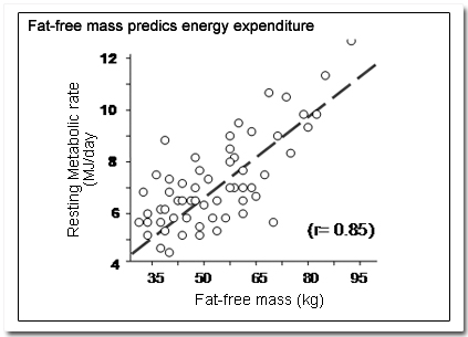
For the example in the figure to contribute to students' understanding, amongst other things they must be able to:
- understand what it means to say that one variable "predicts" the values of another variable
- recognise how this kind of representation can be used to support this kind of statement.
- appreciate that each plotted point represents a pair of measurements of two variables associated with one individual.
- have a sense of the notion of error in measured data
- understand the basis for the concept of a best-fit line and why it is useful.
- know what the correlation coefficient is and what one can conclude from its given value ("r = 0.85")