(making sense of an argument that uses tabulated data)
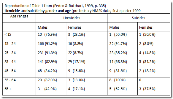
Understanding the medical texts in epidemiology requires critical interpretation of a wide range of data representations and a basic understanding of statistical analysis . A very common way of presenting data in the medical literature is in the form of tables, as shown in the following example of an extract from a recommended reading:
- Concerning victim gender and age, Table 1 shows that for both homicide and suicide, males predominate over females in almost all age ranges. In line with universal trends homicidal violence shows a sharp increase at age 15 and remains high into the mid-40s, where after there is a dramatic decline. In the over 65 year age group more females are victims of homicide but this probably reflects the greater proportion of elderly women in the country. (Peden & Butchart, 1999, p. 335)

Peden M, Butchart A. Trauma and Injury. In: South African Health Review 1999, Health Systems Trust, Durban 1999; 331-344
- The text uses quantitative words and phrases like "predominantly", "sharp increase" and "dramatic decline".
- The last sentence draws on an understanding of the relationship and distinction between absolute quantities and relative proportions.
In order to extract useful information from the table students must be able to:
- ask questions like "What comparisons does the structure of the table facilitate?" and "What are the percentages, percentages of?"
- formulate statements like (referring to the percentage at the top left): "76.9% of the homicides of people under 15 years in age were males" (not 76.9% of the male homicides were under 15" or "76.9% of under 15 year old males were homicides" etc.)
At the same time students need to navigate the connections between the text and the data in the table.